Colour is where sound-to-image work feels most magical and where it is most often misunderstood. It helps to separate two things clearly.
What science describes. Synaesthesia is a genuine neurological trait in which one sense reliably triggers another. Some people, often called chromesthetes, experience colours when they hear sounds. Researchers such as Richard Cytowic and Jamie Ward have documented that these pairings are consistent for each individual over time — but they differ from one synaesthete to the next. Studies also show broader tendencies in the general population, such as linking louder or higher sounds with lighter colours, yet these are tendencies, not laws.
What artists choose. Most people making music-inspired work are not synaesthetes, and they do not need to be. They choose colours for reasons: memory, temperature, mood, the weight of a bass note. That is the territory of this page.
One piece, several palettes
We asked four readers to listen to the first two minutes of Claude Debussy's Clair de lune (published 1905) and choose three colours each, with a word for every choice. Their swatch rows are below. None is wrong.
Painter, 54
"It sounded like a room with the lights off."
Pianist, 23
"Warm, because my teacher played it for me as a child."
Illustrator, 37
"Cool and floating, almost weightless."
Student, 16
"A garden after rain. I don't know why."
Build your own feeling palette
Start from your three words
Use the quality words from the first station. For each word, ask three questions: is it warm or cool? Light or dark? Vivid or muted? These three dimensions — temperature, value and saturation — are more useful than hue names when you translate feeling.
Mix, don't pick
Rather than reaching for a tube straight away, mix a small swatch for each word. Add a touch of the complement to calm a colour that feels too loud; add white or water if the music felt airy. Paint each swatch on a strip and write the word underneath. You now have a labelled palette row.
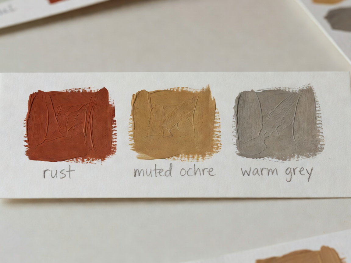
- "Restless" — rust dulled with a little green.
- "Grainy" — ochre dry-brushed for texture.
- "Warm" — grey mixed from rust and white.
Test against the music
Play the track while looking only at the strip. Does any swatch fight what you hear? Adjust it. Josef Albers showed in Interaction of Color (1963) that colours change depending on their neighbours, so a swatch that felt wrong alone may settle once placed beside the others.
Record your reasons
Write one sentence per colour explaining the choice. This is what separates a personal palette from a decorative one, and it lets viewers enter your translation.
Historical colour–sound systems
People have long tried to link the two senses. Isaac Newton, in Opticks (1704), divided the spectrum into seven colours partly by analogy with the seven notes of a musical scale. In the eighteenth century the Jesuit Louis-Bertrand Castel proposed an ocular harpsichord that would show colours as keys were played. In 1893 the painter Alexander Wallace Rimington patented a colour organ in England.
Alexander Scriabin's Prometheus: The Poem of Fire (1910) included a part for a light keyboard following his own key-to-colour associations. The composer Olivier Messiaen described seeing colours in certain chords and wrote them into his scores' notes. Each of these systems is fascinating, and each is personal or theoretical — they disagree with one another, which is exactly the point.
Reflection: would you choose the same colours tomorrow?
Mood, light and memory shift. Repeat the exercise a week later and compare. Stability and change are both interesting results.
Reflection: what colour did you avoid?
An avoided colour can be as telling as a chosen one. Try adding it in a tiny amount and see what it does.